CMU Health Services Website
Jan. 2025 - May 2025
Timeline —
Role —
Design Lead User Researcher
Annie Geng Yuyang Geng Elly Young Milan Minott Instructor: Philip Marchetti
Collaborator —
Tools —
Figma

“A real-time vending machine platform that enhances product access, clarity, and user comfort for campus wellness.”
In partnership with CMU Health Services, we improved the Wellness-To-Go program, which provides students with convenient access to health products via on-campus vending machines. Recognizing the urgent need for real-time stock transparency, we designed a user-facing website displaying product availability, machine locations, and privacy-related information. Through iterative prototyping and user feedback, we refined the design to enhance convenience, clarity, and comfort.

01. Context + Goals
The Wellness-To-Go program gives CMU students and community members affordable access to essential health products through three vending machines on campus. These items include sexual health products such as condoms and pregnancy tests; over-the-counter remedies; and harm reduction tools such as Narcan and fentanyl test strips. The products are available at free or discounted rates with secure, private payment options.
01. The Background

Main Client
We mainly worked with Noah Riley, the Health Promotion Program Director of CMU Health Services. We also worked with Wren Ritchie, the Health Program Assistant Program Director, and Siva Komaragiri, a Peer Health Advocate who is an integral member of the project.
Other stakeholders
CMU Health Services’ Medical Director and Associate Director of Operations, Other Peer Health Advocates, other UHS staff, and CMU students and community members.
02. Our Client & Stakeholders

Our client had two main concerns that they wanted to address through this project.
Users have no access to real-time stock information on the vending machines
Restocking the machines is time-consuming: Current platforms lack real-time data for certain products and don’t allow for automation.
Our goal was to conduct in-depth research to further explore the challenges our client faced and ideate potential solutions to address these concerns.
03. Initial Challenges
02. Research
To better understand clients' concerns and identify challenges students face, we used 4 research methods to gather key insights.
01. Research Methods
Literature Review of 3 articles on contraceptive knowledge and stigma.

Surveys with 61 CMU undergraduates—capturing perspectives from both users and non-users.

10 Interviews and 1 direct observation with workers, experienced users, and inexperienced users to learn about experiences and restocking process.


Our team employed various approaches to synthesize and make sense of the findings.
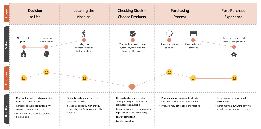
Using insights from our interview notes, we created 2 user journey maps to define key stages, actions, and pain points. The first focuses on the front-end experience, outlining key stages.
To identify operational and communication gaps, we also developed a back-end user journey map based on interviews and in-person observations with the client. This map outlines key stages in the staff workflow.
02. Synthesis

Additionally, we collected 64 data points from all the survey and interview notes. Using affinity clustering, we organized the data points into 3 groups that revealed 4 key themes. This process helped usprioritize the most critical user needs.

From our synthesis, 5 key insights emerged that highlight the major barriers students and our client face.
Insight #1: People don't use vending machines due to lack of awareness and information about the services.
03. Research Insights

48.6% students reported that they did not know the service existed or how to access it.
"I did not know that there were any resources about the vending machines online" — a non-experienced student interviewee
"I usually go to CVS to get health products because it’s convenient for me.” — A Non-Experienced Student Interviewee
"I prefer to get resources that are closer to me when I am not feeling well." — An Experienced Student interviewee
Many students prefer nearby, easy-to-use options—often turning to CVS or Amazon for their simplicity.
Insight #2: Convenience strongly influences health product purchases
Price matters—66.5% of experienced users cited low cost as a key reason for using the machines, but some non-users were unsure if prices were actually lower than other options. Additionally, 46% of respondents wanted clearer instructions, especially for complex items.
Insight #3: People need clear information about health products to make informed decisions

We found that while many students are comfortable using the vending machines, privacy concerns—especially fear of judgment—can lead to hesitation. Some students avoid using the machines in public or near acquaintances.
Insight #4: People have different levels of privacy concerns when accessing the machine.

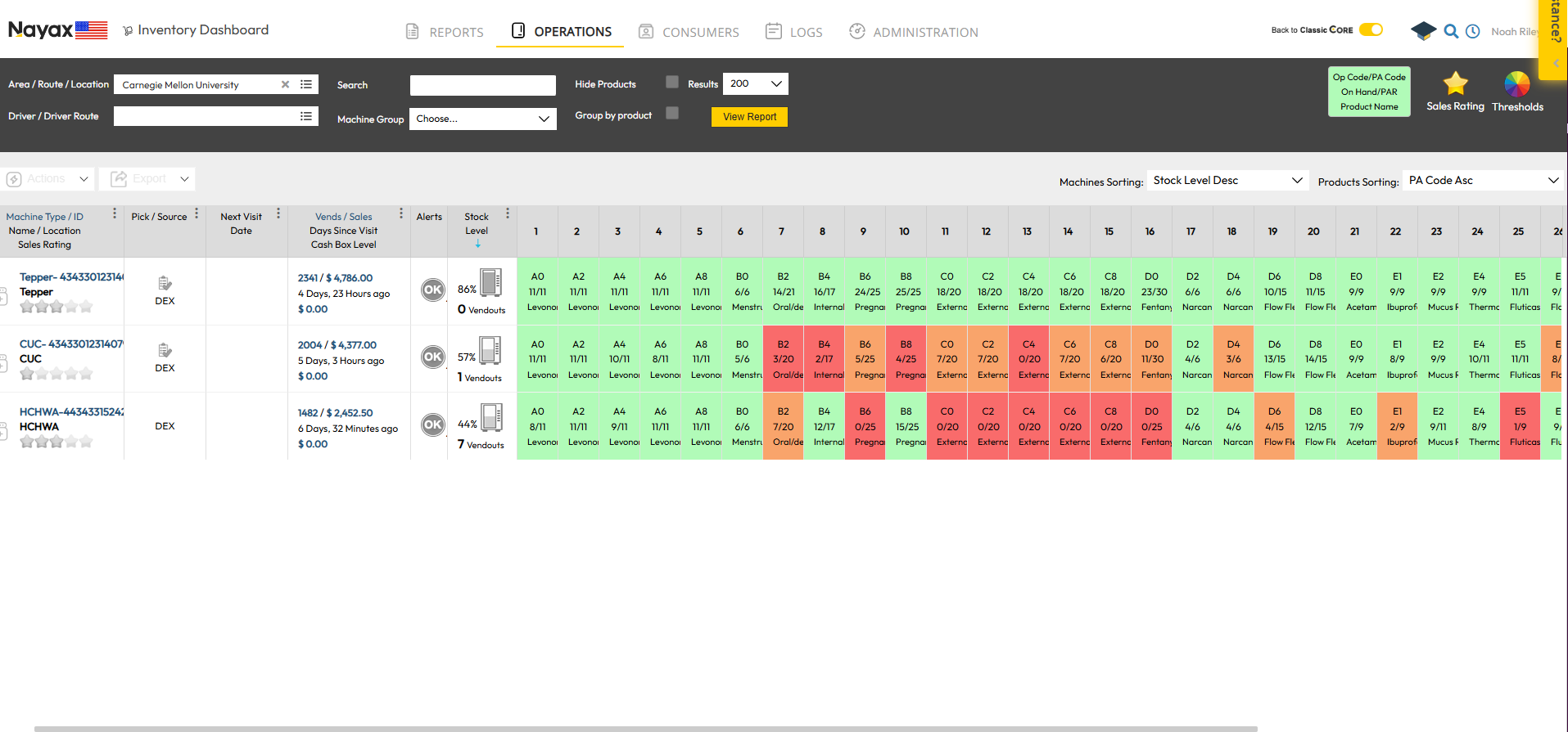
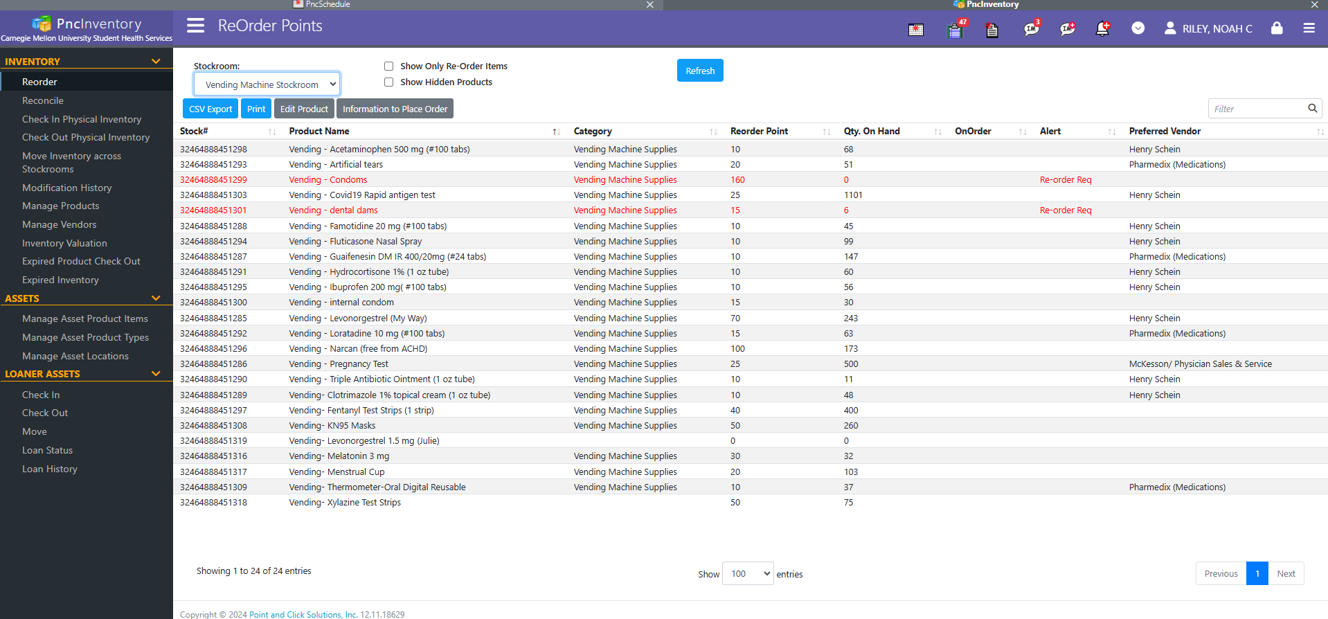
Expert interviews revealed that inventory management and restocking are two major challenges. Currently, the client manually updates inventory monthly using two disconnected systems—Point and Click for stock and Nayax for transactions—resulting in mismatches between machine and storage inventories. Staff also report long hours restocking due to high volumes and limited workforce.
Insight #5: Lack of real-time stock communication causes inventory management challenges.
03. Ideation
Moving on to solution, from the client’s perspective, we explored the possibility of connecting the PnC and Nayax systems by consulting both the client and CMU’s website builder. However, the builder raised concerns about linking the CMU website to external platforms. Meanwhile, our research revealed that students face more pressing challenges.
After further discussion with the client, we chose to prioritize the end-user experience over backend integration. A user-centered solution offered greater potential to enhance satisfaction by simplifying access and delivering clear, relevant information.
01. Problem Scale
‘‘Develop an easy-to-access platform that provides student users with all information needed to use the machine conveniently in their daily lives without privacy concerns?’’
So, how might we…
02. Platform Decision
Then we started to think about final output.
We considered many options…

Browser Plug-in
Mobile App
Physical Solutions
It’s most convenient for users to access
It’s most cohesive for a large amount of info
It allows for privacy
It’s the easiest for client to implement
But we finally decided on making a website since…
After finalizing our solution platform, we held a rapid brainstorming session to generate content ideas for the website. Key categories included product info, stock updates, machine locations, troubleshooting, privacy, UHS resources, and crowd-sourced answers. We then organized these into pages within a sitemap.
03. Rapid Brainstorming & Sitemap
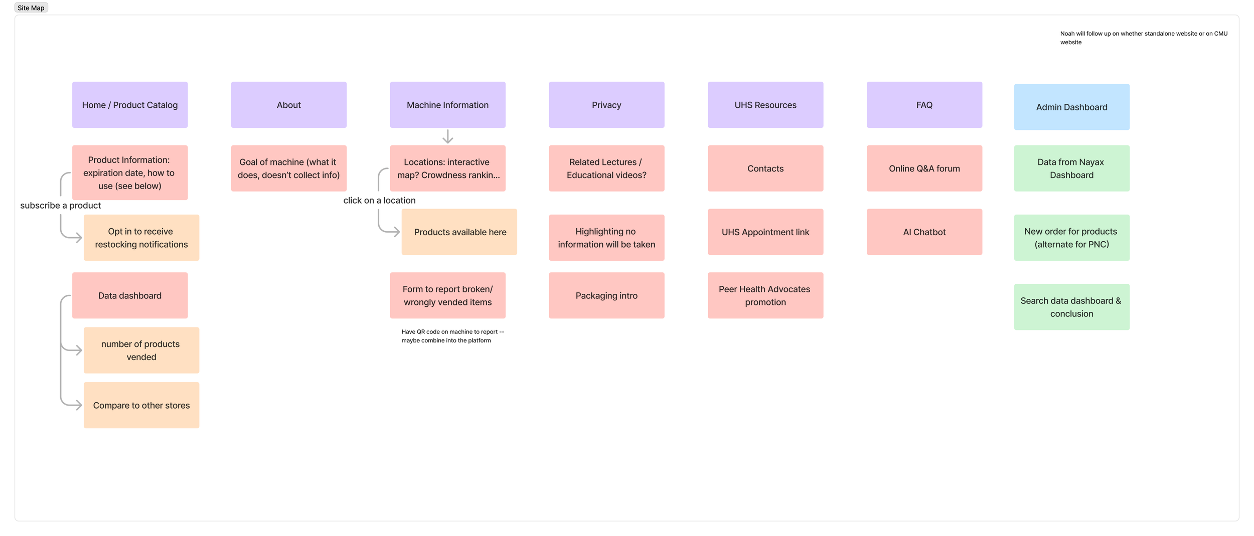
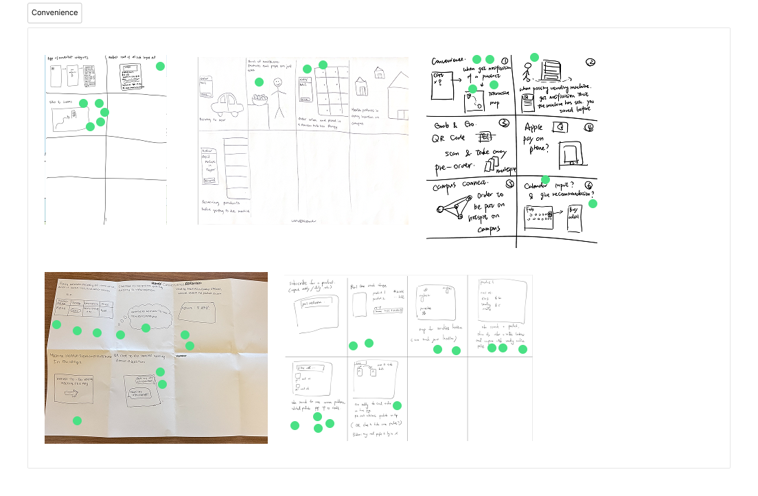
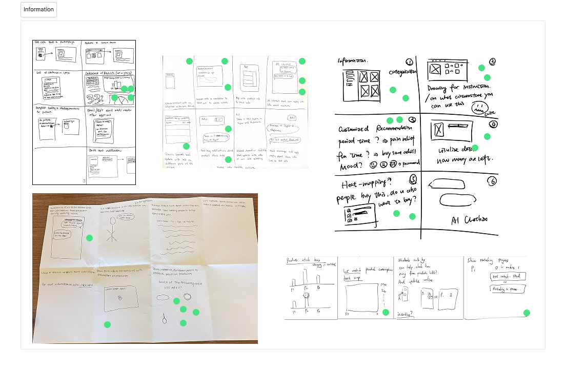
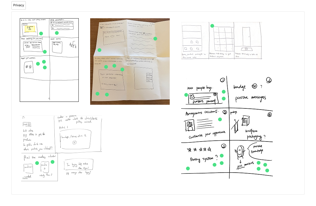
To determine site features, we used the Crazy 8’s method across three rounds focused on convenience, information, and privacy. From 79 ideas generated, team voting helped us narrow down to 5 key features: a product catalog, machine location info, a product dashboard, an AI chatbot, and a privacy pop-up.
04. Crazy 8’s

We also brainstormed about the design style and rationale
CMU brand consistency & Accessibility
Intuitive understanding & Visual comfort & creativeness
05. Design Rationale
04. Prototyping + Iterations
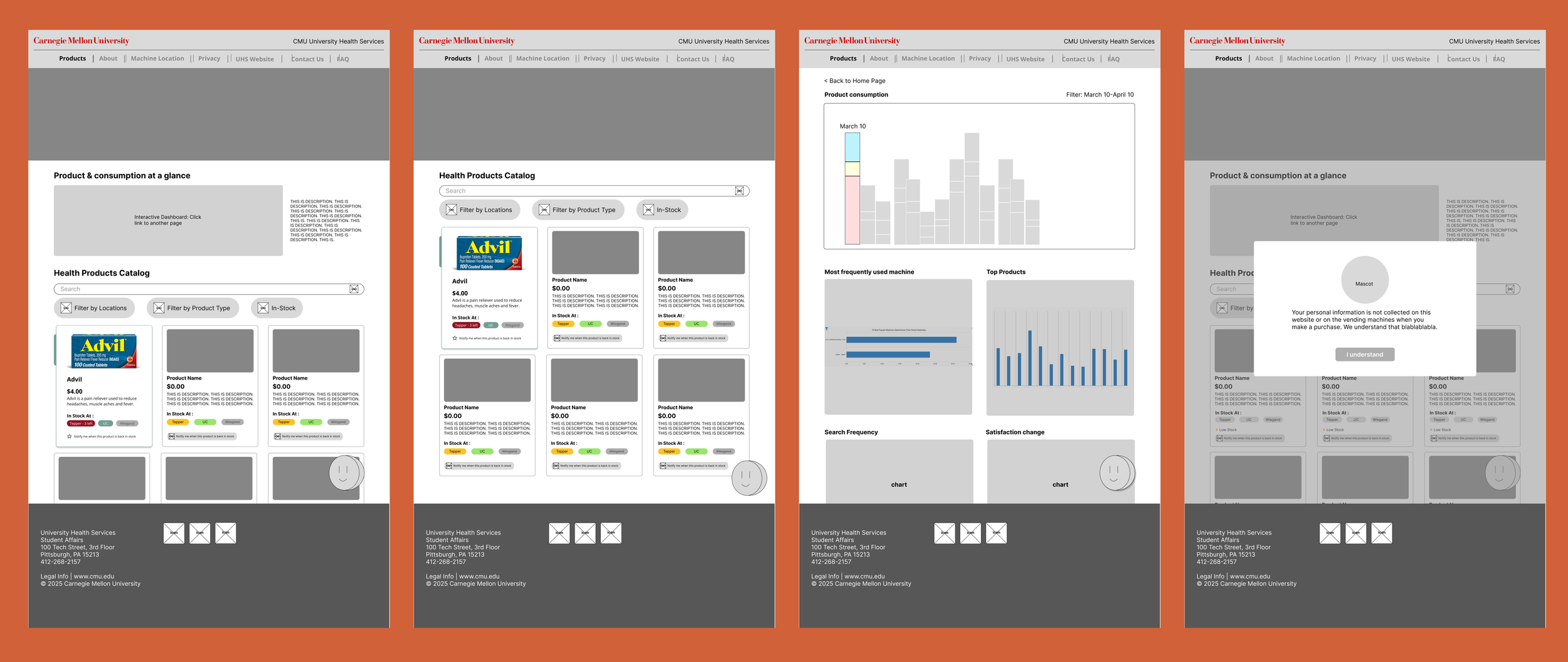
To begin testing our ideas, we first created a prototype focused on core features. Three designers explored different directions before aligning on a unified design that highlighted the product dashboard, catalog, AI chatbot, machine locations, and privacy pop-up. We built wireframes for key pages and developed variations of the chatbot and product page for A/B testing.
01. Low- to Mid- fi Prototype
To refine our design and ensure it met user needs, we conducted usability testing on our low-fidelity prototype.
Our user tests focused on evaluating the prototype’s effectiveness, usability, and overall user experience. 6 CMU students participated—two unfamiliar with the vending machines and four with prior experience.
We used a combination of think-aloud protocols, task-based questions, A/B tests, questionnaires, and post-test interviews.
02. User Testing #1
Testing Insights:
#1: Users prioritize features like the stock indicator and machine location. An AI chatbot and product dashboard is not necessary.
#2: Stock indicators need to be more clear, especially the color coding.
#3: Users need more guidance on where the machines are located, such as an interactive map or more detailed images of the machines.
#4: The privacy pop-up is important, but it needs to be presented in a more engaging way. 4 out of 6 people dismissed the pop-up intuitively.
#5: Users want the homepage to contain a introduction and bestsellers.

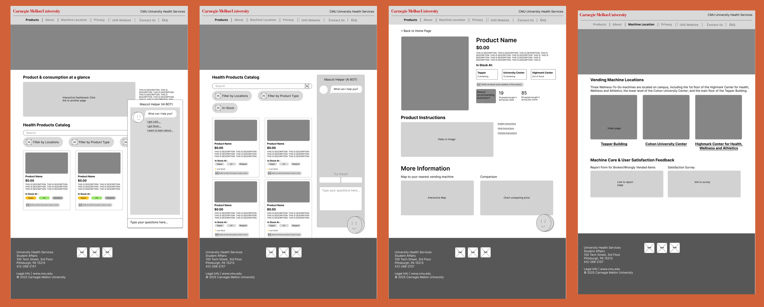
Based on user insights from testing, we developed a mid- to high- fi prototype. We applied a design system aligned with CMU branding to ensure consistency. This prototype excluded the AI chatbot and data dashboard, and introduced refined stock indicators, privacy banner and pop-up, image guides to machine locations, and a recurring mascot to enhance engagement.
03. Mid- to High- fi Prototype

To validate our mid-fidelity prototype, we conducted usability tests with 7 participants: 4 unfamiliar users and 3 familiar users. Our goals were to gather feedback on core features, assess the clarity of stock and location information, and select the best version.
We used think-aloud protocols and conducted A/B tests.
04. User Testing #2
Testing Insights:
#1: The importance of product instructions and price comparisons varies by user type: unfamiliar users prioritize clear product instructions, while familiar users placed greater importance on price comparisons.
#2: Button designs need to be systematized for consistency.
#3: Users expressed a desire for clearer guidance when a product is out of stock, as well as more general assistance.
#4: A banner at the top of the page is preferred to pop-up windows.


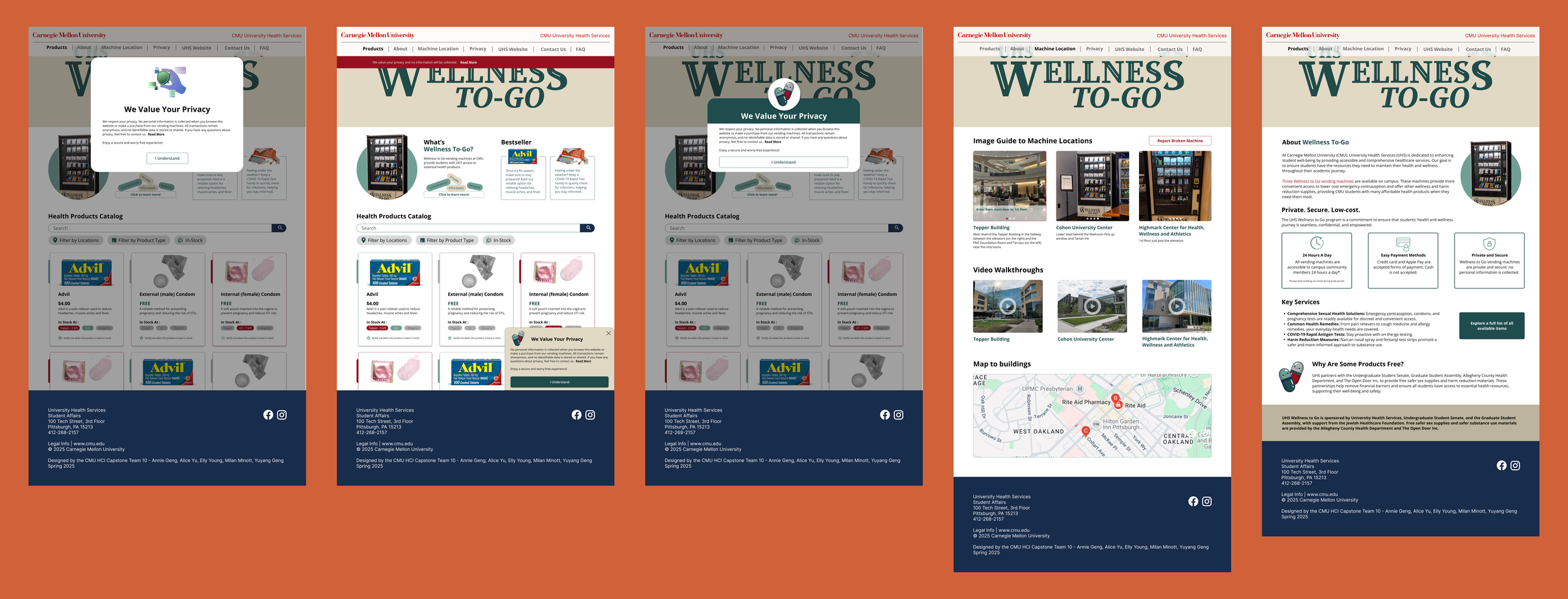
We revised the design of our final prototype based on insights from the second round of user testing to validate it. We then consulted with the client, who arranged a meeting with CMU’s marketing team. This meeting ensured that the design would align with university branding and meet stakeholder expectations. While the overall design was well-received, a few final considerations remained.
06. Client & Marketing Alignment
Final Insights:
#1: Some text lacks sufficient contrast with the background, making it inaccessible for some users.
#2: Replace the image of pills with condoms to help reduce stigma and make students feel more comfortable accessing these products.
#3: Add a clear and direct way for users to quickly share thoughts and feedback with the team at ‘Contact’ page.
#4: Find a way to inform students not to take too many products from the machine
05. Final Design
After incorporating user feedback and client input through multiple rounds of iteration, we finalized our design. The following section showcases the final product's key features and explains how they address the core needs identified.
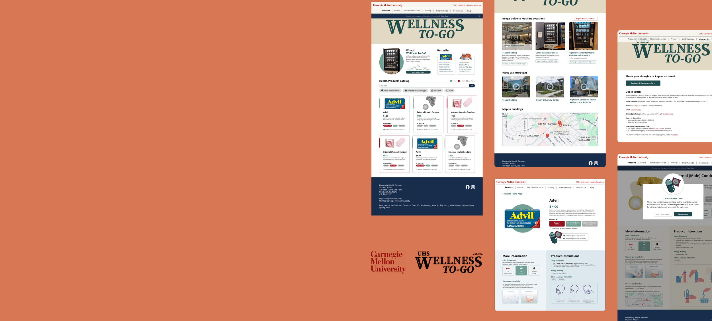
01. Information Hub
One of our key research insights is the lack of awareness and information about vending machine services. To address this, we created an information hub that includes a product catalog, an "About" page, and a detailed FAQ section.
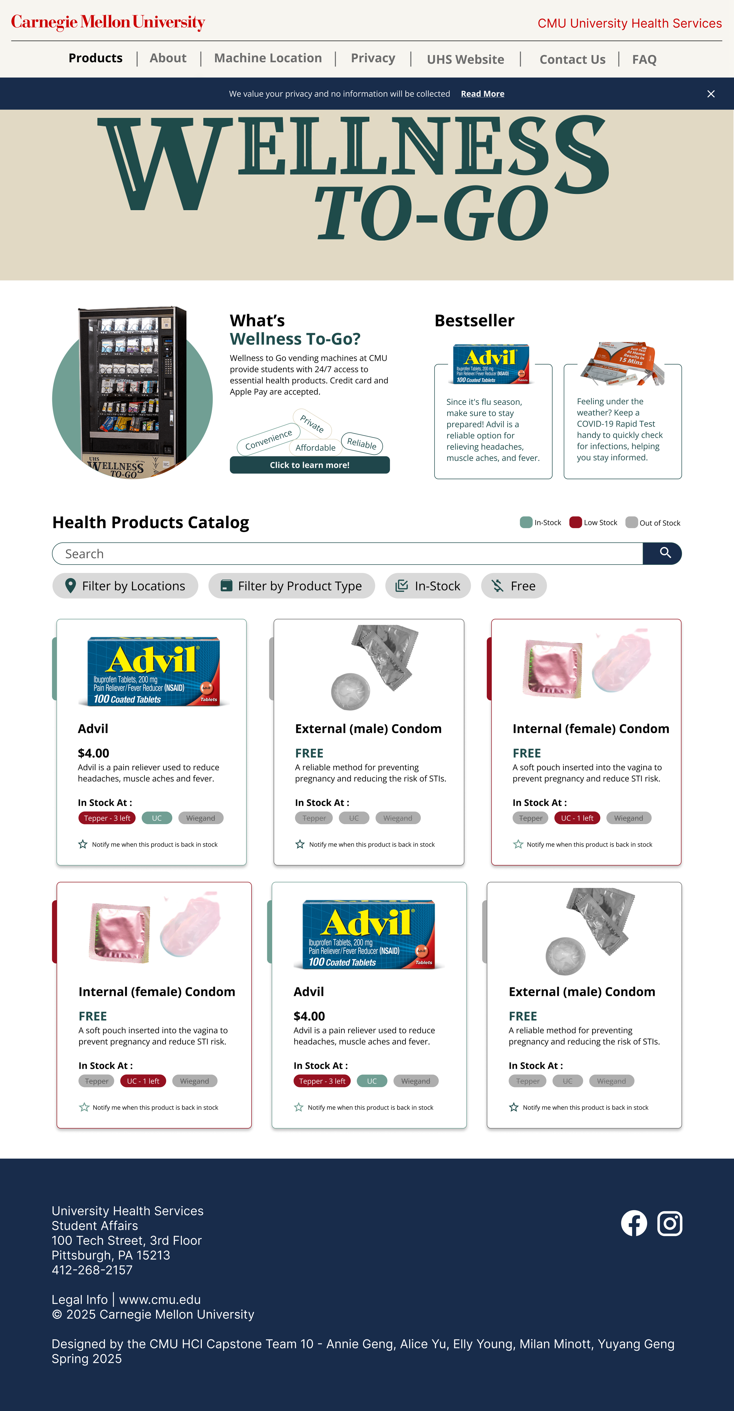
Home Page
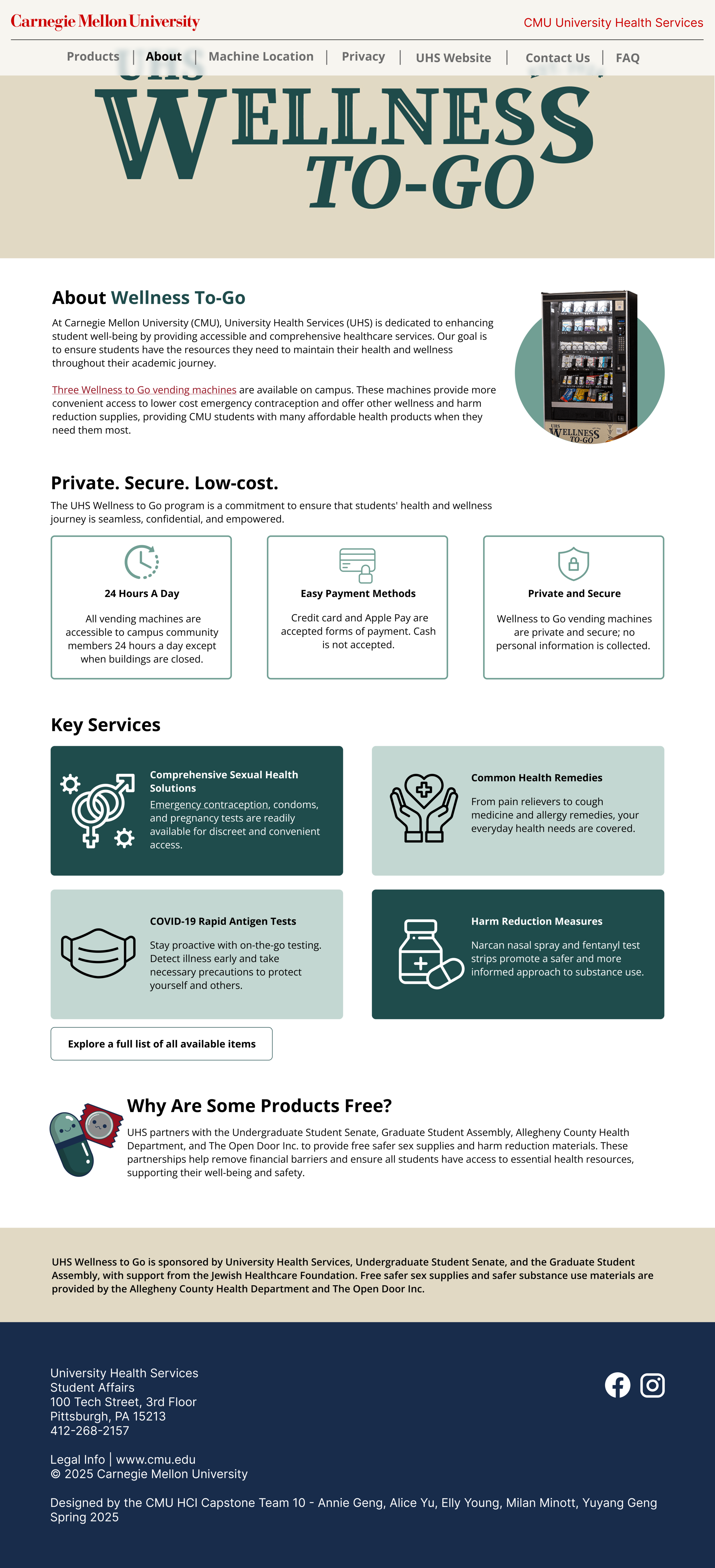
About Page
To address the impact of convenience and price on purchasing decisions, we added features that improve access and transparency. Users can view machine locations with photos and video walkthroughs, check product availability by location, and compare prices with CVS and Amazon to see the cost benefits of using Wellness-To-Go.
02. Smart Access & Pricing

Product Detail - Advil
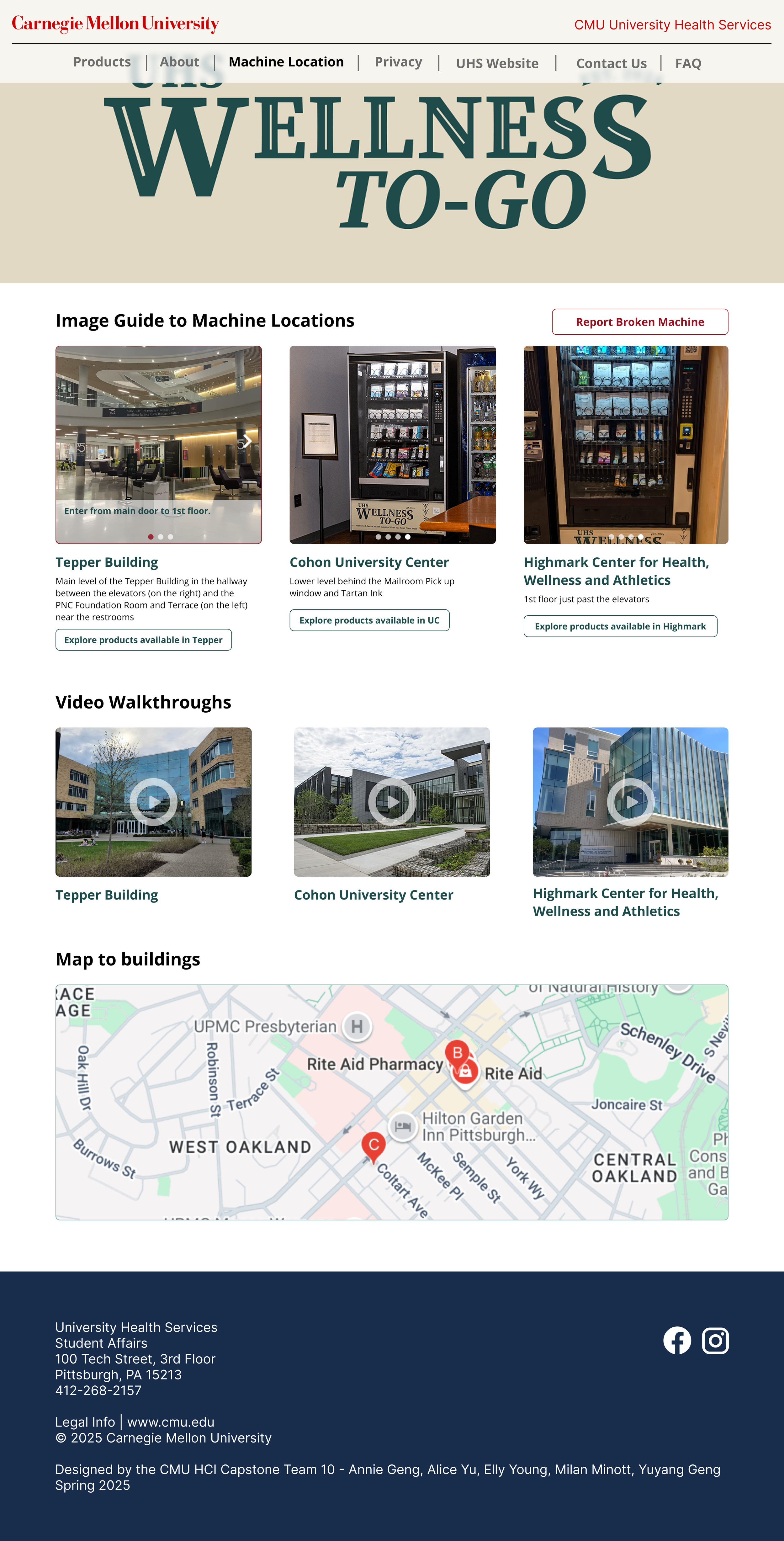
Machine Location
Our research showed that students often struggle to understand health products due to unclear information. To address this, we added detailed product descriptions, clear usage instructions, and allergy warnings. We also included guidance for out-of-stock situations, helping users find alternatives or know when to check back.
03. Product Support & Guidance

Product Detail - Condom

Pop Up Messages
Our research revealed varying levels of privacy concern among users. To address this, we implemented two mascots, surveys for feedbacks, a banner reinforcing discreet access and a dedicated privacy policy page. These features aim to reassure users and promote confidence when accessing sensitive health products through the vending machines.
04. Privacy

Contact


Privacy Banner
FAQ

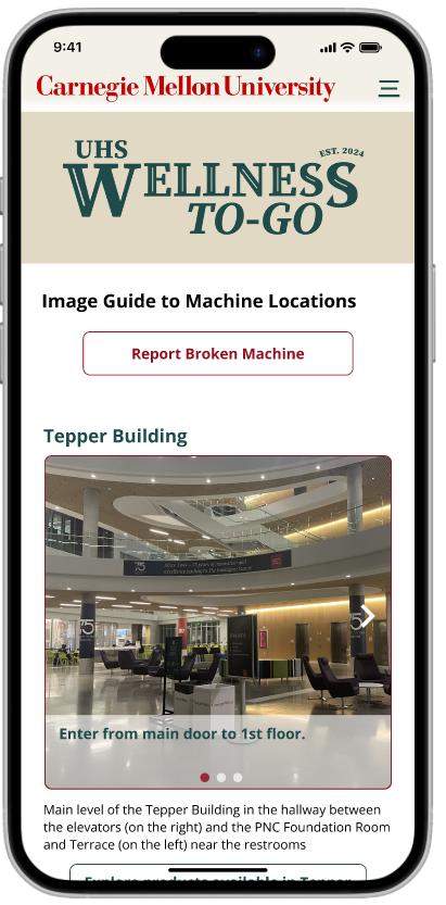
To improve accessibility, we designed a mobile version of the prototype. It allows users to browse products, check stock, and locate machines directly from their phones or tablets, ensuring a user-friendly experience across devices.
05. Mobile Prototype


06. Beyond Design
In addition to our high-fidelity Figma prototype, our team also implemented a coded prototype, with key pages coded in HTML, CSS, and Javascript. Our coded prototype can be found at this link: https://atgeng.github.io/cmu-wellness-to-go/index.html
01. Technical Implementation
After handing off our final deliverables, we will support CMU Health Services as needed in preparing for the website’s Fall 2025 launch. The goal is to provide students with convenient, real-time access to product info and machine locations, ensuring a smooth and successful rollout.
This project was a thorough and rewarding experience. It allowed us to tackle a real-world challenge from start to finish. Not only did it deepen our skills in user-centered design, but it also provided a valuable opportunity to collaborate closely as a team. Throughout the process, we learned the importance of communication, adaptability, and shared problem-solving, making it a meaningful team effort.
02. Next Steps & Reflection